MyAnimeList Review Process UX Evaluation
MyAnimeList is a platform here users track, review, and discover anime. However, despite reviews being central to discovery and credibility, many users struggled to find, start, or complete the review process. This project focused on redesigning the review experience to reduce friction, improve clarity, and increase contribution rates.
ROLE
TOOLS
Figma
TIMELINE
4 Weeks
Problem
Users want to share opinions and discover new anime through reviews, but the current review flow is difficult to find, visually overwhelming, and cognitively demanding.
As a result: users abandon reviews mid-flow, review contribution remains low, platform credibility and engagement suffer
Research Methods
As research methods we used: user interviews, usability testing, heuristic evaluation, and early prototype testing.
Target Users
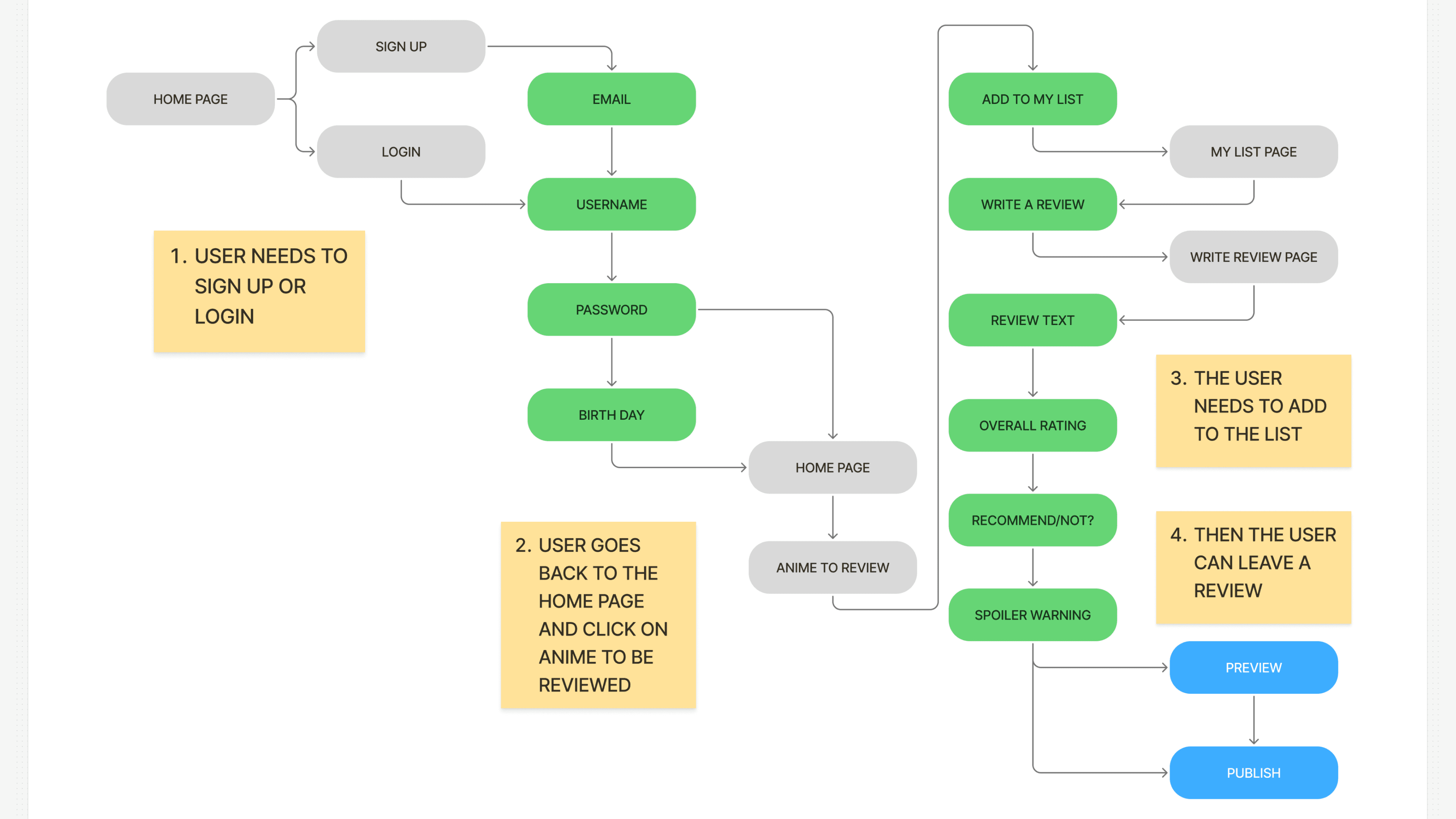
This project focused on engaged MyAnimeList members who actively track anime and contribute ratings or reviews. These users often complete an anime and expect a clear, efficient way to write or manage reviews—typically navigating through My List rather than individual anime pages.
Secondary users include long-term and power users who rely on fast access, consistency, and efficient workflows when contributing content at scale.
Key Insights
Reviews feel hidden, users struggle to locate where and how to write a review.
Too much cognitive load upfront, long forms, and visually dense layouts, that lack hierarchy
Different users review differently, some users want fast ratings, others want detailed feedback.
Research highlights what users struggle with, while cognitive design principles help explain why those struggles occur. By grounding design decisions in human cognition, the resulting solutions feel intentional and inevitable rather than arbitrary, creating a clear logic chain from user behavior to cognitive load and, ultimately, to design response.
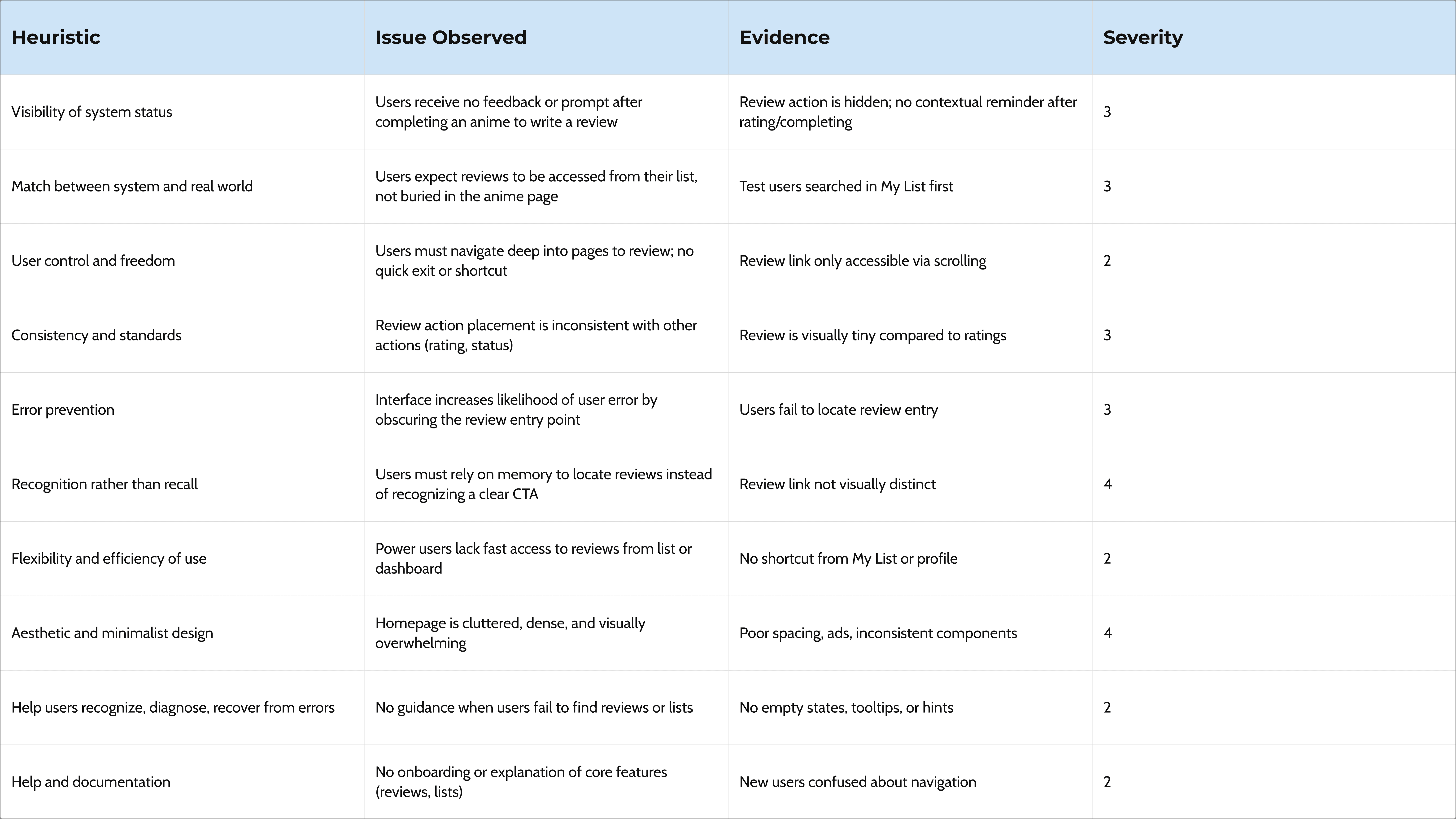
Key Takeaway from the Heuristic Evaluation:
The primary usability breakdown is not user motivation, but discoverability. Reviews are treated as a secondary action in the interface, despite being a core user goal. This misalignment forces users to rely on recall, increases friction, and results in missed engagement opportunities.
Design Goals
Make the review action immediately visible, reduce effort for quick reviews, support deeper reviews without forcing them, improve visual hierarchy and scannability.
Ideation
Early research revealed that there is no single review behavior. Some users prefer to rate content quickly with minimal effort, while others want space for more expressive, long-form reviews. To accommodate these different needs, we explored two prototype directions and tested both to better understand how review structure impacts usability and engagement. Testing both prototypes allowed us to evaluate completion rates, perceived effort, and overall user satisfaction.
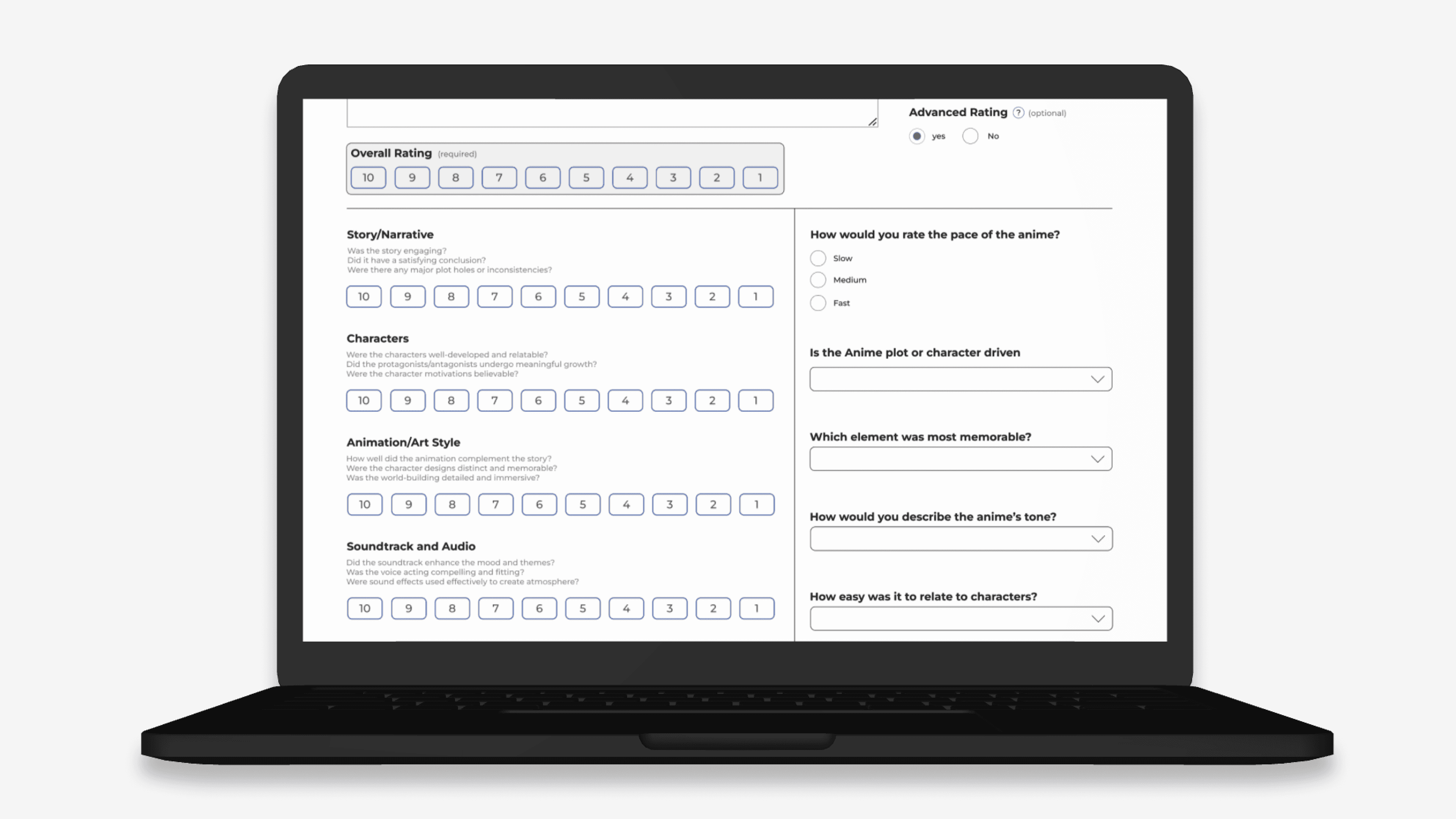
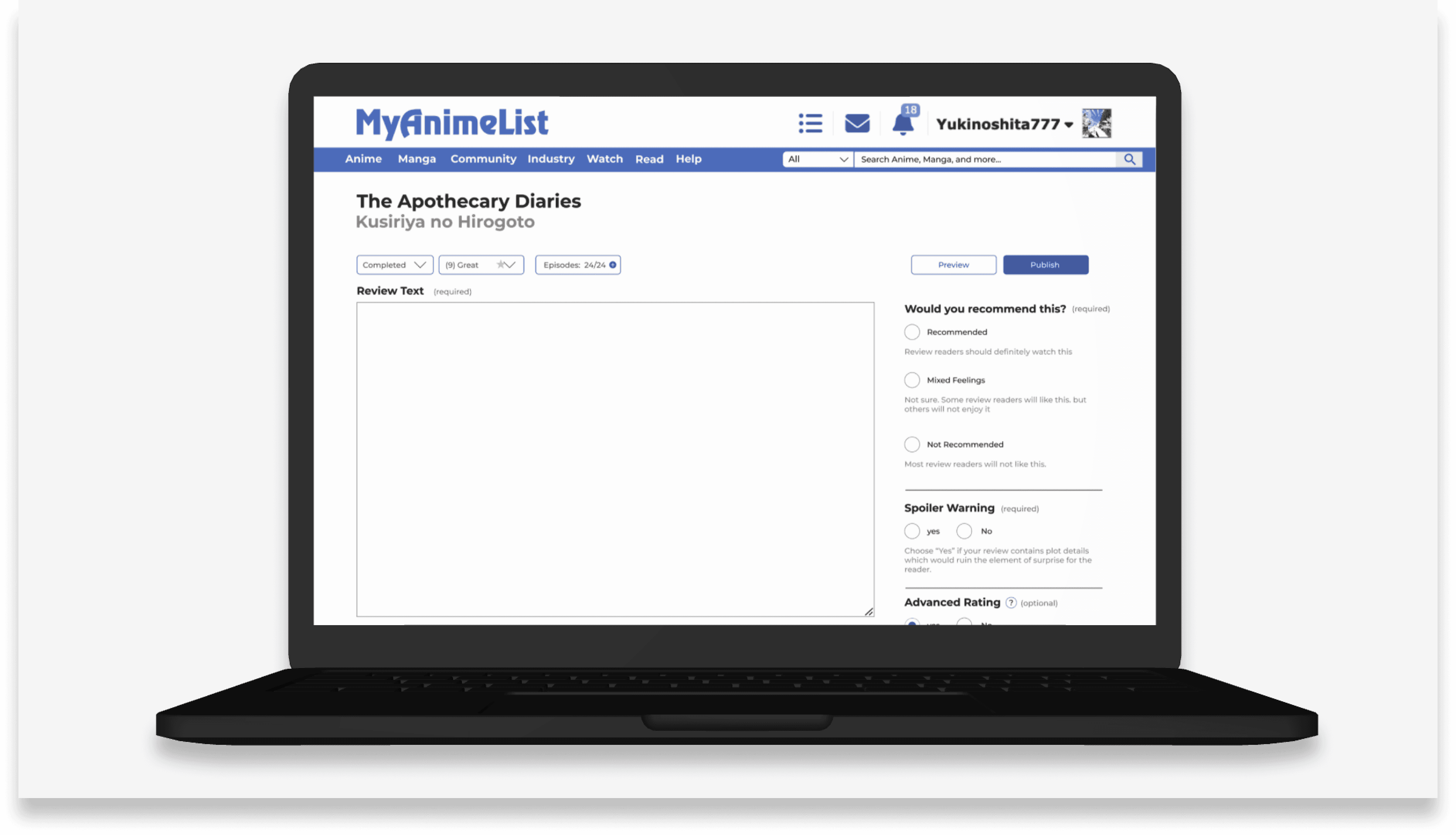
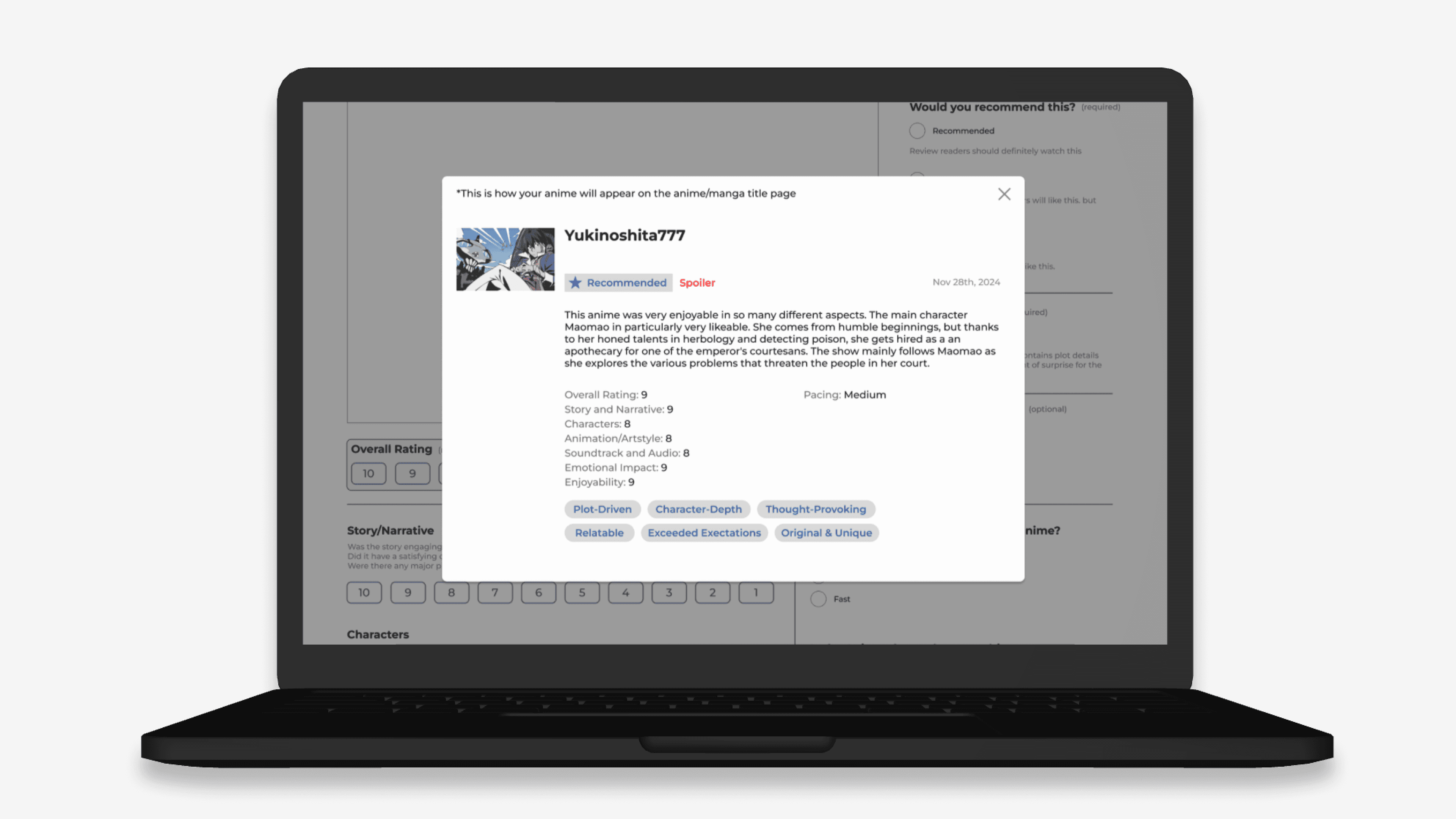
Prototype 1, guided review flow is focused on clarity and confidence, this direction emphasizes a prominent “Write Review” call-to-action, strong visual hierarchy, and progressive disclosure for advanced inputs to reduce cognitive load. Prototype 2, category first review designed for speed and low commitment, this direction prioritizes structured category ratings with an optional “Advanced” toggle for users who want to add written feedback.
Prototype 1
Prototype 2
Testing & Validation
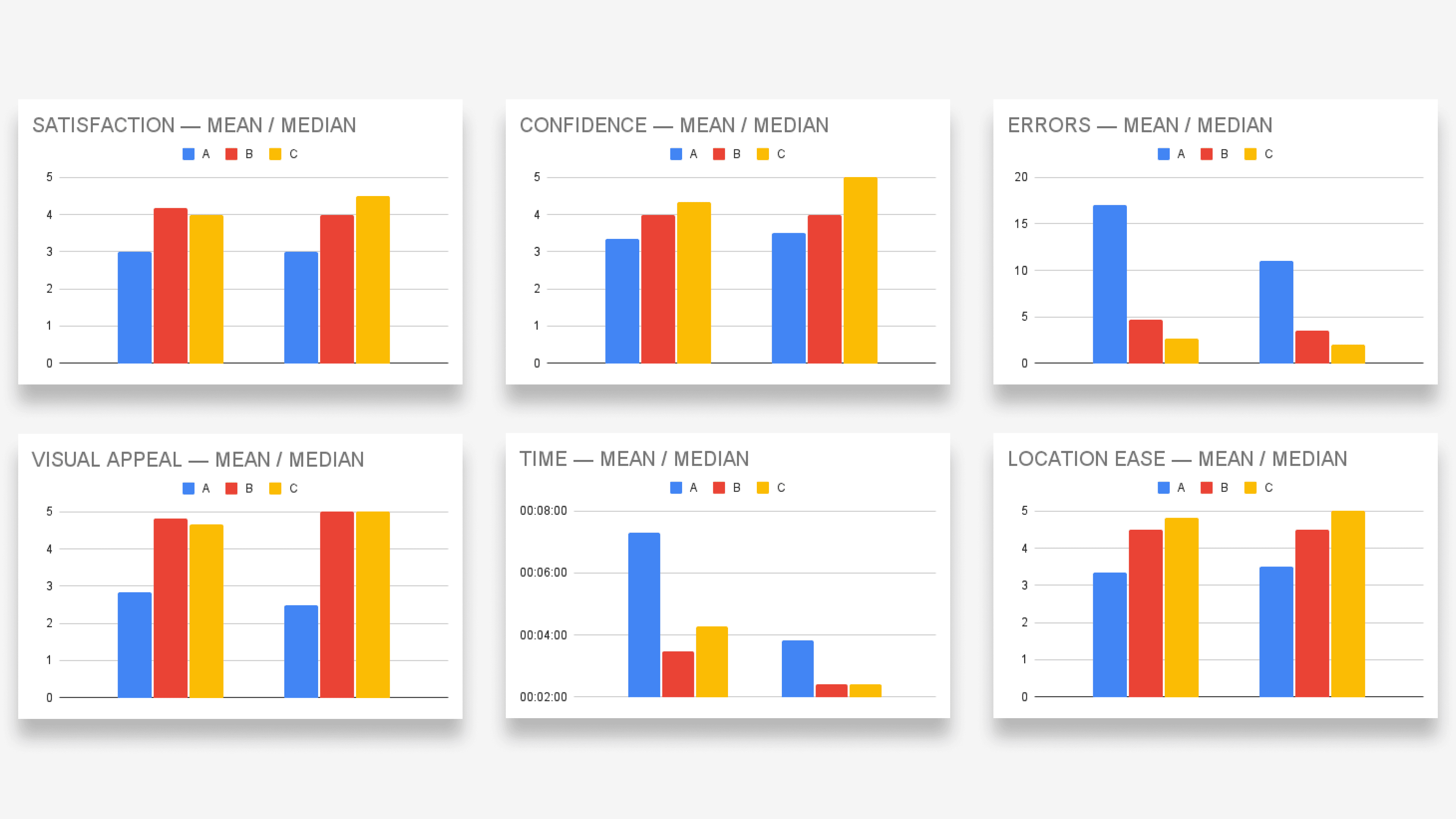
We conducted A/B/C testing using early prototypes alongside task-based usability testing to observe how users navigated the review flow and where friction occurred. Key findings showed distinct strengths across both directions. Prototype 1 consistently scored higher in clarity, confidence, and overall satisfaction, while Prototype 2 performed better for speed and quick review completion.

Key findings from A/B/C testing:
Prototype 1 performed best in:
Visual appeal (Median = 4.83)
Satisfaction (Median = 4.17)
Fastest completion times (~3m 29s)
Reduced unnecessary clicks
Prototype 2 performed best in:
Ease of locating reviews (Median = 4.83)
Lowest errors (Median = 2.67)
Least redundant interactions
We found that both prototype to have 90% reduction in user errors, 60% faster in task completion, 60% increase in user satisfaction.
Cognitive Design
The redesign was informed by cognitive UX principles to reduce mental effort, increase confidence and support different review behaviours. User experienced friction when faced with dense layouts and too many inputs (choices) upfront. Progressive disclosure was used to surface only essential actions first, allowing advanced options to appear when needed. Reviews actions and entry points were made highly visible to prevent users from having to remember where or how to write a review. Clear labels and consistent placement reduced reliance on memory. Not all users want to invest the same level of effort, the review flow supports quick and low commitment ratings while allowing users to gradually add more detail if they wish so. Spacing, section headers and consistent component sizing guide attention and help users understand what to do next without excessive scanning or interpretation. Primary actions such as “write a review” were made larger and easier to reach (Fitts’s law & moto effort) reducing interaction friction and encouraging participation.
Final Direction
Based on testing outcomes, and principles explained in the previous section, we selected Prototype 1 as the primary direction. It made the review pathway more obvious, reduced confusion through a clearer visual hierarchy, and still supported advanced users through optional inputs. Insights from Prototype 2 were retained to inform future iterations, particularly for optimizing fast, low-commitment review flows.